# Dialogs
A dialog is a “conversation” between the system and the user. It is prompted when the system needs input from the user or to give the user urgent information concerning their current workflow. There are two types of dialogs, modal and non-modal.
# Overview
Dialogs work best when used for short tasks or to alert the user to task relevant information. Dialogs are useful in many scenarios; they are less disorientating than navigating a user to a new page for simple tasks or knowledge gathering. However, dialogs are disruptive and can be distracting to the user. Use them sparingly.
A dialog is triggered by a user’s action, appears on top of the main page content, and is persistent until dismissed. The purpose of a dialog should be immediately apparent to the user, with a clear and obvious path to completion.
# Anatomy of a dialog
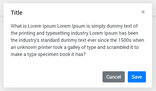
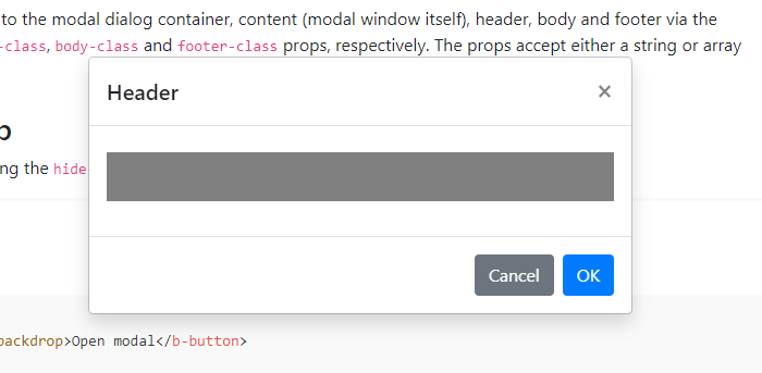
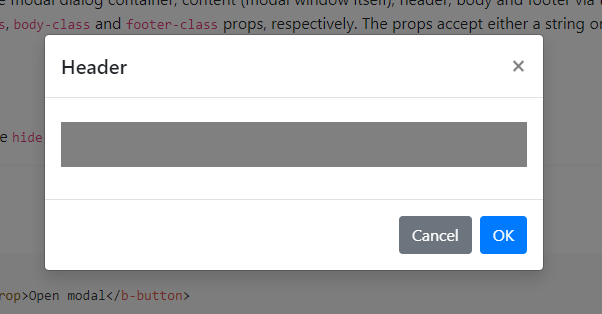
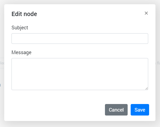
- Header: Includes a title, optional label, and the close icon. The title should be brief and clearly describe the dialogs’s task or purpose. Use the optional label above the title set the context for the information in the dialog.
- Body: Contains the information and/or controls needed to complete the dialog’s task. It can include message text and components.
- Actions: The main actions needed to complete or cancel the dialog task. Button groupings change based on modal variant. Use descriptive words for the actions like Add, Delete, Save and avoid vague words like Done or OK.
- x: The close x icon will close the dialog without submitting any data.
- Overlay: (Modal dialogs only) Screen overlay that obscures the on page content.
When to use a dialog
- Use to focus the user’s attention.
- Use for short task completion.
- Use to gather input from the user.
- Use to display relevant information.
# Dialog types
There are two types of dialogs, modal and non-modal.
A modal dialog triggers a state (or mode) that focuses the user’s attention exclusively on one task or piece of relevant information. When a modal dialog is active, the content of the underneath page is obscured and inaccessible until the user completes the task or dismisses the modal.
When a non-modal dialog is active the user can continue viewing and interacting with the main page while the dialog is open. Non-modal dialogs are commonly used to present non-critical information or optional user tasks.
| Type | Usage | Context |
|---|---|---|
| Modal | Use to present critical information or requrest required input needed to complete a workflow. | Focuses the users attention exclusively on one task or piece of information. On-page content is obscured from the user while the modal dialog is open. |
| Non-modal | Use the present non-critical information or optional user tasks. | On-page content can be accesed and interacted with while the dialog is still open. |
# Best practices
Use dialogs sparingly
Don’t overuse dialogs. They are disruptive and can easily annoy the user if used incorrectly or too frequently. When dialogs are used for non-workflow related tasks, it is likely a user will start ignoring or dismissing the dialogs without fully understanding the content. This can cause users to make hurried or impulsive choices when dealing with more critical dialogs.
Dialogs should be user initiated
A user action, such as clicking a button, should trigger the dialog to open. Don’t interrupt the user by opening a dialog when they aren’t expecting it. Avoid system generated pop-ups that distract the user while working, such as Net Promoter Score. Triggers can either be a direct or indirect consequence of a user’s action. An example of an indirect action is a user closing a tab with unsaved content that then causes a dialog to ask if they want to save their changes before closing. If the system is autogenerating an alert that is not a consequence of a user’s action, but a response to processes happening in the background, then a toast notification should be used instead.
Keep dialog tasks simple and focused
Dialog tasks should be direct and easy to complete. Avoid feature creep in dialogs where a once simple dialog has become bloated with interactions. When deciding to use a dialog consider how the task could expanded in the future and if a dialog will be able to effectively incorporate additions. An example of a simple task would adding a new item to a list where the item details are added and submitted via a dialog.
# Modal dialogs
Use a modal dialog to present critical information or request user input needed to complete a user’s workflow. Modal dialogs are disruptive and should be used sparingly. When active, a user is blocked from the on-page content and cannot return to their previous workflow until the modal task is completed or the user dismisses the modal. Any information or input requested should be directly related to the user’s task at hand.
Modal dialogs are commonly used for short and non-frequent tasks, such as editing or management tasks. If a user needs to repeatedly perform a task, consider making the task do-able from the main page. A modal dialog adds to a workflow’s interaction cost; it takes the user out of their previous context and requires additional actions to complete and dismiss. When considering, ask is this critical to their current workflow?
# When to use
An immediate response is required from the user
Use a dialog to request information that is preventing the system from continuing a user-initiated process.
Notify the user of urgent information
Use a modal dialog to notify the user of urgent information concerning their current work. Commonly used to report system errors or convey a consequence of a user’s action.
Confirm a user decision
Use a modal dialog to confirm user decisions. Clearly describe the action being confirmed and explain any potential consequences that it may cause. Both the title and the button should reflect the action that will occur. If the action is destructive or irreversible then use a transactional danger modal.
# When not to use
Modals prevent access to the main page
Don’t use if additional information outside the modal needs to be consulted. While a modal dialog is active a user cannot interact with the main page and is restricted to only the information in the modal for making decisions. Modal tasks should be easy to complete with the limited information presented in the dialog itself. If a user needs access to additional information then consider using a full page instead.
Don’t nest modals
One modal should never trigger another modal. If the first modal task is dependent on a confirmation modal to approve then that first task should not be preformed in a modal.
Don’t make modals full page
If a modal dialog needs more space than the large modal component allows then the content should be displayed on a page of its own and not in a modal. A modal is not an alternative to page.