# Tier layout In-progress
Infopiphany UI uses the powerful mobile-first flexbox grid (via the <b-row>, <b-form-row> and <b-col> components) to build layouts of all shapes and sizes thanks to a twelve column system, five default responsive tiers, CSS Sass variables and mixins, and dozens of predefined classes.
Items can “flex” their sizes to respond to the available space and can be aligned with respect to their container or each other. achieving equal-column layouts (irrespective of the amount of content inside each column) is a breeze.
# Overview
Infopiphany’s tier layout is built using bootstrap’s grid system which uses a 12 column grid. Bootstrap’s grid system uses a series of containers, rows, and columns to layout and align content. It’s built with flexbox and is fully responsive. Infopiphany`s tier layout system consists of 4 tiers which holds all details based on their assigned information and elements. Tier layout system let user to navigate inside each panel in a glance without making it look complicated.
In addition, Tier Layout uses vue-router to navigate to each route.
| Tier | Description |
|---|---|
| 1 or left panel | tier-1 contains all parent data from the server, eg. users list. |
2 optional | tier-2 holds the data or information of the selected user from tier-1. User can manipulate the data in this panel by clicking one of the action button located at the top right corner of the panel. |
3 optional | tier-3 contains the transaction related to the selected user from tier-1. In this panel the developer can also add other use cases by adding another tab. |
| 4 or right panel | tier-4 is optional and will be based on use case. |
Preview of the layout
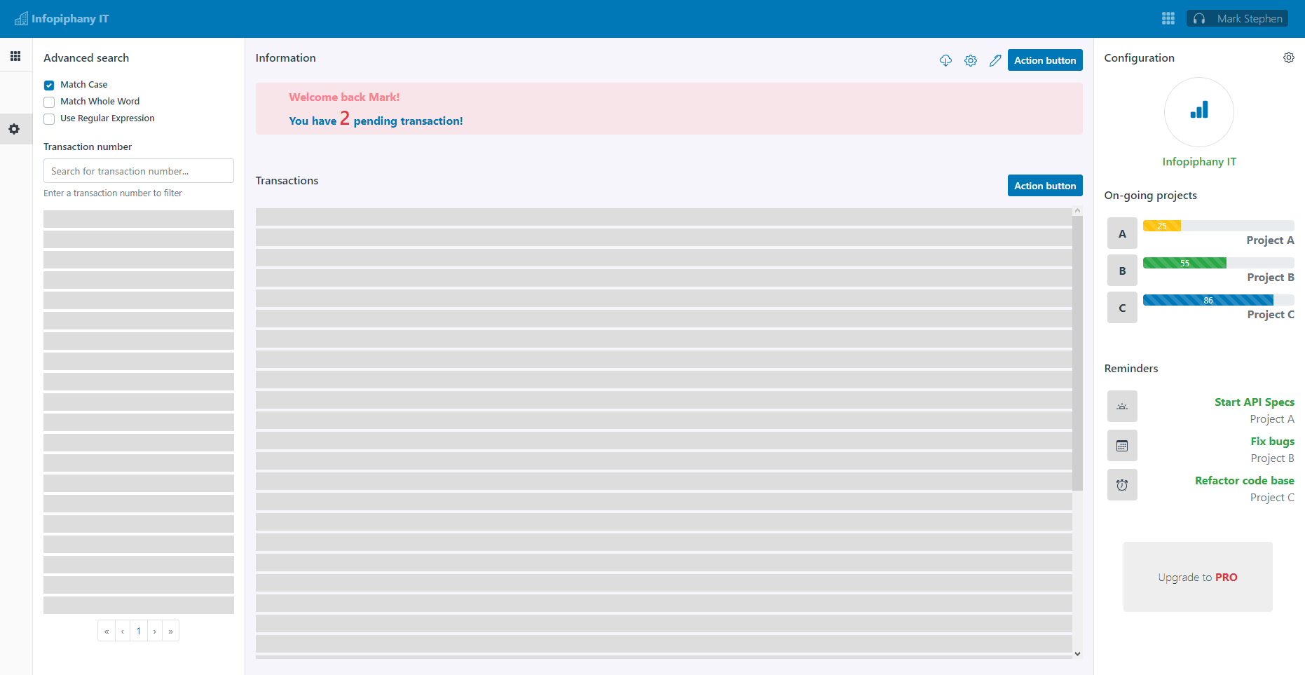
# Tier 1
Tier 1 contains the lists of data from the server which the user can filter and select to display all of it's general information inside tier 2 panel.
By default each tier has horizontal padding (called a gutter) for controlling the space between them. This padding is then counteracted on the rows with negative margins. This way, all the content in your columns is visually aligned down the left side. In addition tier-1 has a padding-top of 3.5rem and a padding-bottom of 5rem, this helps add space between the top navigation bar and tier-1.
Contents
- Search and filter: Tier 1 or left panel should always have a way to search and filter the data inside the table or list.
- Data table: Data table or list is required inside
tier 1or left panel. - Pagination: Add pagination to split the database output into more manageable chunks or pages.
Accepting suggestion for tier 1 behavior when a user is viewing the site on a mobile device.

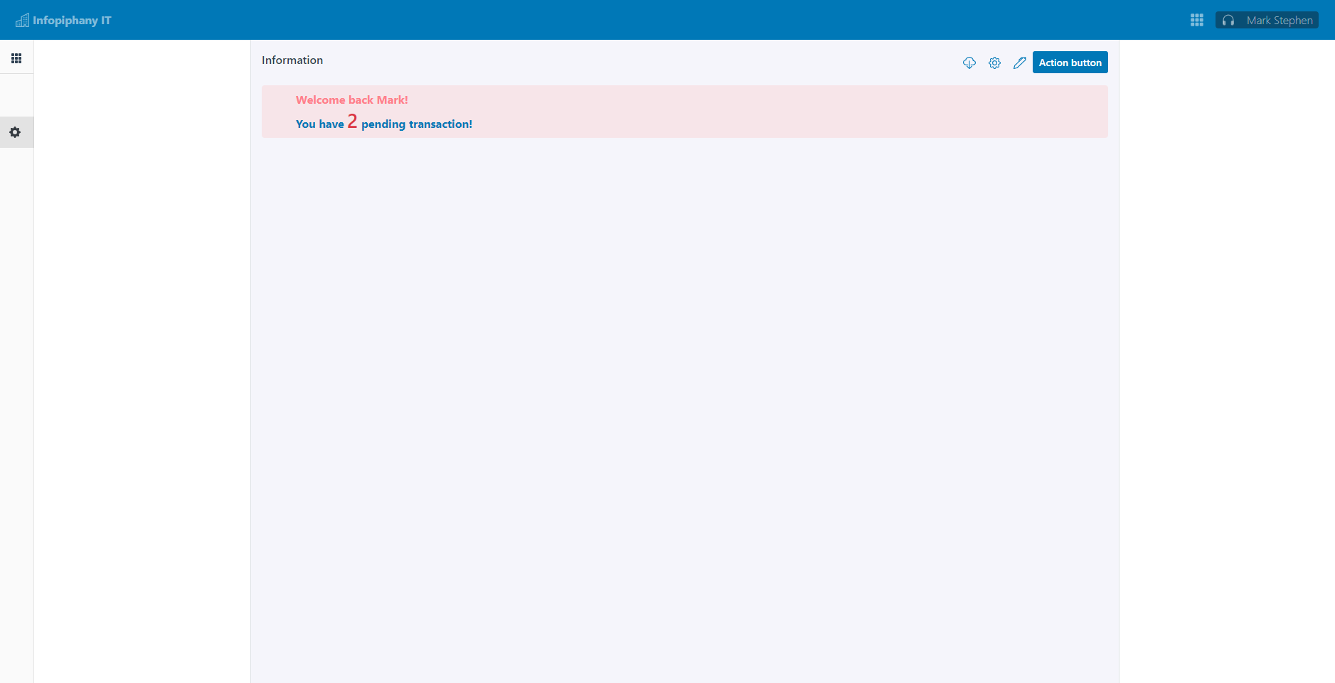
# Tier 2
Tier 2 panel or Top Panel contains the current information of the selected data from tier-1 and contains the action button (edit create delete remove) for the current selected data. tier-2 can contain other contents depending on the developer use case.
There are also available slots for tier 2 which separates the header or title and action buttons at the top of the panel. We recommend to use the available slot to avoid adding unnecessary style set. tier-2 has a default min-height of 25vh.
Refer to common action pattern for complete guide on how to position each buttons in your form and page.
| Slot name | Description |
|---|---|
title | Header slot for tier 2 panel |
actions | Container for action buttons |
default slot | Slot for tier-2 contents. |
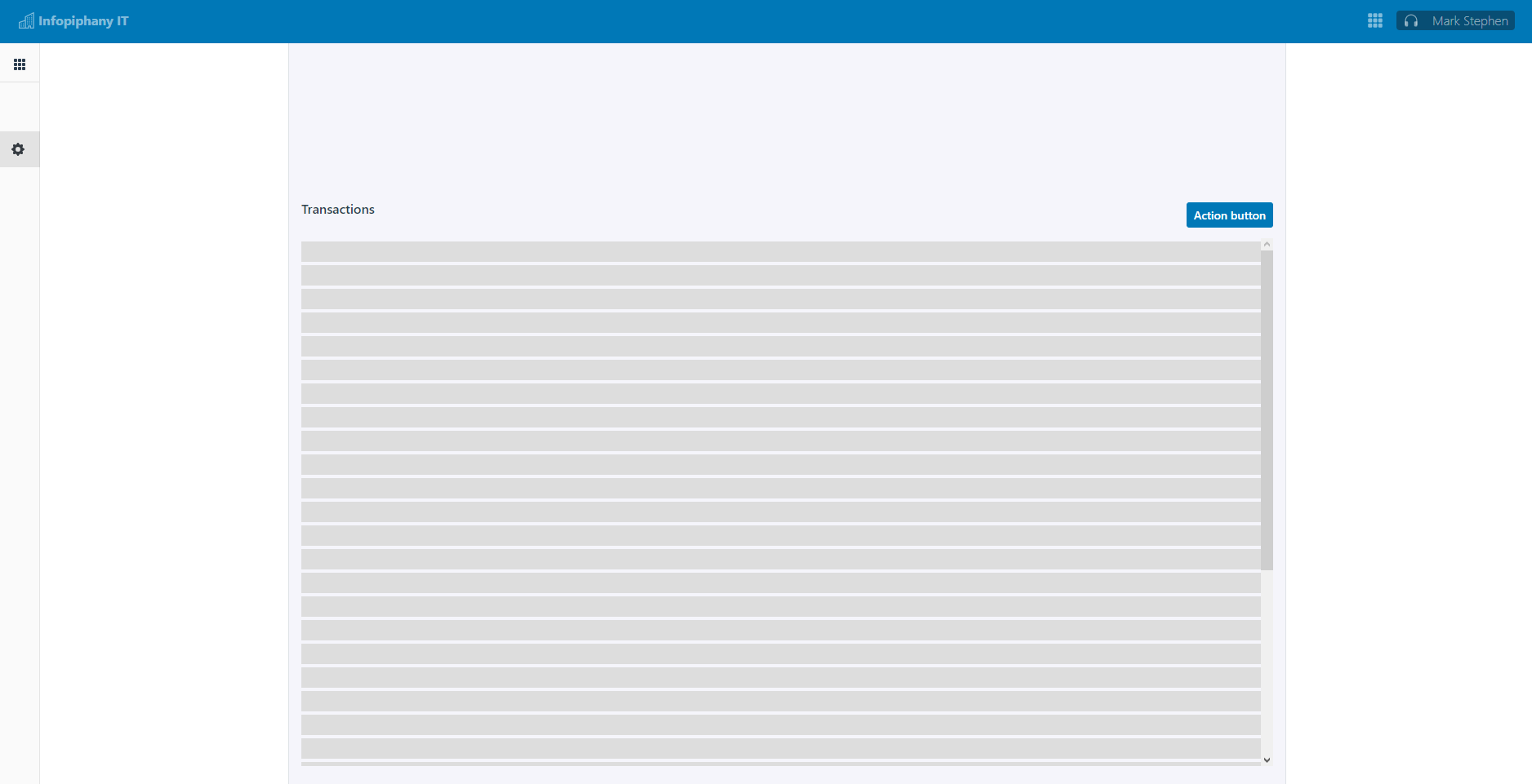
# Tier 3
Tier 3 panel or Bottom Panel contains all the related transactions based on the selected data from tier-1. In this panel we have set a fix height of 75vh and added an horizontal and vertical scroll whenever the content exceeds the container's height.
There are also available slots for tier 3 which separates the header or title and action buttons at the top of the panel. We recommend to use the available slot to avoid adding unnecessary style set. tier-3 has a default height of 75vh.
We recommend to add a way to search and filter data from the table of transactions
| Slot name | Description |
|---|---|
title | Header slot for tier 3 panel |
actions | Container for action buttons |
default slot | Slot for tier-3 contents. |
pagination | Slot for tier-3 pagination. |
Tier 3 or Bottom Panel default slot is wrapped with an overflow-auto rule set to allow scrolling vertically and horizontally.
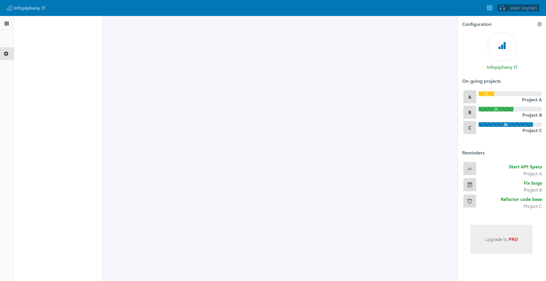
# Tier 4
Tier 4 panel or right panel is optional. If tier-4 slot is not in use, tier-2 and tier-3 will occupy all remainding space. The contents for this panel will be based on developer's use cases.
# Tier content
We have added a component called IpyTierContent. This component composes of tier-2 and tier-3 also known as IpyTopPanel and IpyBottomPanel components. Both IpyTopPanel and IpyBottomPanel components should be use together with IpyTierContent. Each component acts as a wrapper for tier layout contents and has a fix style for named slot title, actions, content and pagination.
# Using with router view
# Router setup with router-view
Our sample router set up would be displaying an empty state when there are no selected data from left-panel. Once the user selected a data from left-panel only then it will push a new route which will be { name: 'user.detail' } and will display the component of UserContent.vue
import Vue from 'vue';
import VueRouter from "vue-router";
Vue.use(VueRouter);
const routes = [
  {
    path: "user",
    component: () => import("../views/User/User.vue"),
    children: [
      {
        path: "",
        name: "user.index",
        component: () => import("@components/EmptyStates/EmptyState.vue"),
      },
      {
        path: ":id",
        name: "user.detail",
        props: true,
        component: () => import("@components/User/UserContent.vue"),
      },
    ],
  },
]
The current semantic for using <IpyTierLayout> with vue-router. In this example left-panel contains list of data which is binded to a router-link. Once clicked, it will push a new route containing { name: 'user.detail', params: { id: 1 } }
<IpyTierLayout>
  <template v-slot:left-panel>
    <div>
      <router-link>Item 1</router-link>
      <router-link>Item 2</router-link>
      <router-link>Item 3</router-link>
    </div>
  </template>

  <!-- Tier Content -->
  <router-view></router-view>

  <template v-slot:right-panel>
    <div>
      Contents
    </div>
  </template>
</IpyTierLayout>
# Router setup with component
In this setup, our router path contains an optional params id to display the selected data from left-panel
import Vue from 'vue';
import VueRouter from "vue-router";
Vue.use(VueRouter);
const routes = [
  {
    path: "user/:id?",
    name: "user",
    props: true,
    component: () => import("@components/UserContent.vue"),
  },
]
<IpyTierLayout>
  <template v-slot:left-panel>
    <div>
      Contents
    </div>
  </template>

  <!-- Tier Content -->
  <IpyTierContent>
    <IpyTopPanel>
      <template v-slot:title>Information</template>
      <template v-slot:actions>
        <b-btn>Action</b-btn>
      </template>

      <div>
        Contents
      </div>
    </IpyTopPanel>

    <IpyBottomPanel>
      <template v-slot:title>Information</template>
      <template v-slot:actions>
        <b-btn>Action</b-btn>
      </template>
      <template v-slot:pagination>
        <b-pagination></b-pagination>
      </template>

      <div>
        Contents
      </div>
    </IpyBottomPanel>
  </IpyTierContent>

  <template v-slot:right-panel>
    <div>
      Contents
    </div>
  </template>
</IpyTierLayout>
# Properties
| Property | Type | Default | Description |
|---|---|---|---|
collapseSidebarClass | Array Object String | empty string | Sidebar collapsed classes |
isSidebarCollapsed | Boolean | false | Sidebar state |
isDesktop | Boolean | false | Sidebar state for desktop view |
# Slots
<IpyTierLayout> slots
| Slot Name | Description |
|---|---|
left-panel | Tier 1 or left panel |
right-panel | Tier 4 or right panel |
<IpyTopPanel> and <IpyBottomPanel> slots
| Slot Name | Description |
|---|---|
title | Tier header |
actions | Tier buttons |
default slot | Tier contents |
pagination | Tier 3 pagination |
# Importing individual components
You can import individual components into your project via the following named exports:
| Component | Named Export | Import Path |
|---|---|---|
<IpyTierLayout> | IpyTierLayout | @infopiphany/ui/layout |
<IpyTierContent> | IpyTierContent | @infopiphany/ui/layout |
<IpyTopPanel> | IpyTopPanel | @infopiphany/ui/layout |
<IpyBottomPanel> | IpyBottomPanel | @infopiphany/ui/layout |
Example:
import {
  IpyTierLayout,
  IpyTierContent,
  IpyTopPanel,
  IpyBottomPanel,
} from '@infopiphany/ui/layout'
Vue.component('IpyTierLayout', IpyTierLayout)
Vue.component('IpyTierContent', IpyTierContent)
Vue.component('IpyTopPanel', IpyTopPanel)
Vue.component('IpyBottomPanel', IpyBottomPanel)